Friday, 21 October 2011
Tuesday, 4 October 2011
The contents page stands out with its fun and bright colour which attracts the audience and makes the target audience want to read it. There is a page title clearly stated of "CONTENTS" in black bold writing and the name of the magazine (CLASSMATE) is also clear and easy to read.
The pages are clearly referenced with clear numbers and clear page titles which is simple for the younger side of the target audience. The pages have interesting and comedic names which draws in the audience and relates to the target audience. The text is in different sizes to keep the magazine fun and individual and the text fallows the colour scheme of the rest of the magazine.
There is a small caption at the bottom which is catchy and makes the magazine slightly more memorable "SCHOOL'S IN SESSION". This related to the target audience as the audience are at this point supposed be in school and at the time this would be released students would have recently started school for the new term.
Photoshop Preliminary Magazine
 |
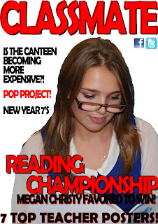
The Mast head of my magazine and easy to read due to the fact that it will be directed from ages 12-18 and parents of children that go to the school in which it is being sold as it is a school magazine. The writing style on the sell lines is easy and there are reference to facebook and twitter of which the magazine can be fallowed on which engages the audience to want to fallow the school magazine more. The main sell line says "READING CHAMPIONSHIP" as it convinces children to want to read more as they will be able to enter the championship.
The main image includes a student from the school which makes the students want to read the magazine more, as it clearly states that this magazine is an indepentdent magazine and is given only to students/parents from this school. The main image ius of the person spoken about in the sell line "MEGAN CHRISTY FAVOURED TO WIN" as it makes the magazine relatable and challenges the rest of the school to take up reading and want to beat the favored winner. The other sell lines speak directly to the target audience about issues that will effect them and others they may know. The offer "7 TOP TEACHER POSTERS" gives the magazine a light and funny mood which draws in the reader as they will be curious to know who the school consider as the "TOP TEACHERS".
The white background of the magazine makes it seem simplistic and is also a signifier of peace and relaxation. The main colour scheme of the magazine are red while and black which all stand out over each other and as red is a connotation to danger it draws in the audience as they want to read what dangerous things are occuring in the school.
DIARY POST 2
In todays lesson we were required to finish our preliminary drawing tasks, we then scanned these into the computer and were needed to make our drawn preliminary task into a slightly more professional looking photoshop document using taken photos and a realistic looking mast head. This preliminary task was to see how our skill were to improve throughout the year. I began by taking the photos of my model and cutting the photos out using photoshop and posting them onto a blank page. I then began to make a mast head and trying to make it look professional.
I began to think of suitable sell lines and using them on my front cover, I used my sell lines and wrote up an offer. I then began working on my contents page of in which I pasted two of my potential front cover images of which i hadn't chosen. I then added an effect to these and started writing page numbers and titles. I added a page title and a magazine title to the contents page for reference.
I began to think of suitable sell lines and using them on my front cover, I used my sell lines and wrote up an offer. I then began working on my contents page of in which I pasted two of my potential front cover images of which i hadn't chosen. I then added an effect to these and started writing page numbers and titles. I added a page title and a magazine title to the contents page for reference.
Diary Post 1
For the AS Level of Media Studies we are required to create a music magazine by fallowing the ideas of making our preliminary meterial (school magazine). We first had to draft this by drawing out our front cover and contents page. This meant in the front cover we were require to include:
- A Mast Head
- Sell Lines
- A Cover Photo
- A Main Sell Line
- Page Numbers
- Page Title
- Page Images
- Page Headings
- Clear Reference between which page number goes to which page
- The Magazine Title
Subscribe to:
Posts (Atom)


